
Shiso + Kaffir
Shiso + Kaffir Gin is the passion project of Vera Kerckhoffs Da Silva, who, drawing on her love of fine delicacies, has created a gin that breaks new ground. Her commitment to quality and timelessness is reflected not only in the spirit itself, but also in the label – produced by unieketiket.nl.
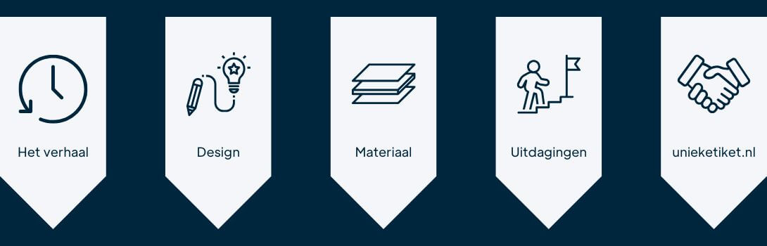
What is your story? Briefly introduce the company and product.
Shiso & Kaffir Gin was created by Vera Kerckhoffs Da Silva, a Portuguese who has lived in the Netherlands for almost thirty years. With her background in high-end delicacies and gastronomy, she developed a gin with a different vision: a gin that is not only mixed with tonic, but can also be drunk pure, just like whiskey.
Instead of using many botanicals, Vera deliberately chose a minimalist and recognizable flavor base. The gin is built around two main ingredients: shiso, an aromatic Japanese leaf with notes of basil and mint, and kaffir lime. These are subtly complemented by tonka bean and chamomile, among others, creating a smooth, balanced and refined taste.
After a year of experimentation, Vera found the perfect balance. The gin is distilled at Distillery De Tweekoppige Phoenix in Zaandam. The bottles are produced in France, lacquered black in Germany and then hand-labeled and numbered by Vera herself.
Today, Shiso & Kaffir Gin is served in restaurants, including Michelin restaurants, cocktail bars and with aficionados worldwide through the webshop.

How did you come up with the design of the label and what is so special about it?
Dark green (Vera’s favorite color) and gold were a must. The idea was to create a label that was elegant and appealing to everyone. It was not to represent a specific time period: not modern and not classic, but timeless. Vera made a simple sketch and shared her idea with a designer friend. Together they created the beautiful Shiso + Kaffir Gin label, produced by the label company Unique Label.
“We would definitely recommend unieketiket.nl because of their professionalism, flexibility and personal guidance. “
Vera Kerckhoffs Da Silva, Shiso + Kaffir
Which material did you choose and why?
I received a catalog of different qualities and textures of paper, some more beautiful than others, which didn’t make the choice easy. But since we also chose a timeless label, I finally decided on an elegant paper with a soft texture, subtle embossing and gold foil.

Were there challenges/difficulties on the way to the perfect label?
While creating the label, we found out that some of the files were out of order. The label designer was living in Canada at the time and later moved to the Netherlands. In the meantime, all the original label files had been lost. Fortunately, Uniek Etiket completely rebuilt the original design. For that we are extremely grateful.
We also received valuable advice on the size of the label. Because the bottle is not completely cylindrical but slightly conical, it was important that the label be adjusted just the right way so that it fits perfectly on the bottle. Again, Uniek Etiket provided us with excellent assistance.
Why would you recommend unieketiket.nl as a printing partner? What service did you particularly like?
We would definitely recommend unieketiket.nl because of their professionalism, flexibility and personal guidance. When the original label files were lost, they completely rebuilt the design. We also received valuable advice on the correct label size, which was important because our bottle is slightly conical. Thanks to their expertise, the label fit perfectly on the bottle and the design came out beautifully.
Would you also like to share your customer story?
Answer the following questions and send us the answers along with your product photos and photos of your team.
- What is your story? Briefly introduce your company and your product.
- How did your label design come about and what is special about it?
- Which label material did you choose and why?
- Were there challenges/difficulties on the way to the perfect label?
- Why do you recommend unieketiket.nl as a printing partner?